-
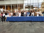
FACS Interior Design I Class
Maria Garcia
Students from the FACS 200 Interior Design course worked together to design projects that physically moved while celebrating one or more tenants of Gestalt Theory. Projects were displayed in the Jerry Falwell Library, and students from the Nature's Scale, The Domino Effect, Stormy Day, The View, Project Runway, We Hold the Light, Simplicity Back to the Basics, Cape Horn, La Medusa, Passive Closure, and Swing into Spring groups gave presentations on their work on April 5, 2022, in the library.
The assignment was to create a project that physically moves while celebrating one or more of the tenants of Gestalt Theory.
Gestalt Theory consists of principles/laws of human perception that describe how humans group similar elements, recognize patterns, and simplify complex images when we perceive objects.
Designers use the principles to organize content on websites and other interfaces so it is aesthetically pleasing and easy to understand.
Each project began with a mind map to generate ideas, followed by: the Programming Phase to discover materials and explore interpretations of Gestalt Theory, the Schematic and Design Development Phase to create plans for the proposed ideas, and finally, the Contract Administration Phase to fabricate the design and put the project on display.
-
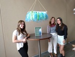
Cape Horn
Madison Allen, Kaylee Keith, and Sophia Vivas
When first given this project, our group decided we wanted to implement nature into the idea of our design. That brought around the idea of water and the ocean. As we contemplated how to create something that ties those ideas together, the Law of Similarity and the Law of Continuity is really what led us to create the hanging display of art that we have now.
As we researched photos of oceans and water movement, we decided on a variety of blue shades and tints as well as one green value to create diversity in the piece. Then we gathered an assortment of materials for the bottom area that engaged the viewer by providing different textures to look at throughout the display. This invoked the use of the Gestalt's Law of Similarity the most because even though we used a variety of materials to create this project, they are brought together by similarity in colors and the way they are all bunched together along the rectangular foam board. This creates a sense of unity, so the influence of placement effected how we see the art. The Law of Continuation was also mentioned to be used in this project as well, and it is used through the rope. The brown color stands out against the sea-like colors used everywhere else and directs your eye from the top of the project to the area that is representing the water itself. The movement that the rope provided helps guide our eyes along the piece without getting lost, creating a visual sense of peace of a continuous flow that isn't harsh on the eyes. The length of each of the pieces of tule, ribbon, and strips of streamers are all roughly equal lengths, so that creates a smooth motion across the board that also guides our eyes. It represents a fluid motion throughout the project, just like how water can call travel throughout the ocean.
When coming up for the name of our project, we wanted it to tie to the idea of ocean and water as well. So, after a bit of research, we came up with "Cape Horn". Cape Horn is the place where the Atlantic and the Pacific Oceans meet. They don't mix however, so it looks like someone drew a line in between the two bodies of water. One side is a deep royal blue while the other side is a greenish watery color. Our project has both green and blue throughout it, expressing the idea of that place. Except ours mixes, so it's the "what if" mentality of the movement between two bodies of water if they did run together. The concept of imagination mixed with nature really influenced our project, and so that made our creativity reach into application of an area that is truly in our world!
-
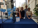
La Medusa
Christa Gillespie, Ivy Helton, Gabby Gordon, and Haley Borcicky
The tenants of the Gestalt Theory that we decided to represent are the Theories of Symmetry, Similarity, and Continuity. We have represented these tenants in the form of a three-dimensional jellyfish. In our design, symmetry is seen in the structure; similarity, or pattern, is seen in the placement of the balloons, and continuity is seen in the tentacles.
During the programming phase, we discussed many different materials we could use to make the jellyfish and decided to use a foam dome, balloons, and streamers. However, making the jellyfish with these materials proved tedious and difficult to maintain. In our final design, we ended up using a clear bowl, tissue paper, balloons, floral garland, PVC pipe, and fishing line to make our jellyfish really come to life and be interactive.
-
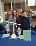
Nature's Scale
Jillian Estep, Amy Short, and Caroline Miller
For our project, We have created a wooden scale that weighs two varying plants on either end. As a team, we decided to present a project that highlights two tenants of the Gestalt Theory,, the first being the law of symmetry. This law can be found through the wooden scale itself, proportionally symmetrical on either end. Although one may be heavier than the other, they both come from the same family, being that they are plants, which provides that basis of similarity.
To begin, as a group we gathered together the materials we would need to create the scale. Once gathering all our materials, we began the building process. For the building process, we first drilled together the two wooden dowels to create the "seesaw" portion of the scale. Then, we securely drilled the wooden dowel into the wooden base. Once we had the raw scale built, we then added the two hanging macrame glass plant holders to either side using hot glue. Once the glue dried, it was time for the decorative process.
The decorations used for this project make up a large portion of the scale, so as a group we put much thought and effort into deciding what we wanted the final result to look like. We decided to paint the two wooden dowels white, and the wooden base green. We then wrapped both fake vines and fairy lights around the wooden dowels, glued thick twine around the wooden base, and finally placed the plants and pebbles into the glass bowls to finish it off.
-
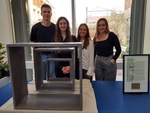
Passive Closure
Zach Alberts, Justine Lockman, Savanah Steines, and Anna Grace Myers
Over the course of this semester, we have discussed a multitude of topics, ranging from Gestalt theory and how it plays a role in every aspect of design, to Biophilia and the incorporation of eco-living dwellings for urban environments. Sticking with the themes from this semester, our first task as a group was to establish a Gestalt theory that we wanted to represent. In unison, we agreed on closure as our primary focus for design to remain simplistic without leaving extensive room for questioning. Through our research and discovery process, we began to pull inspiration from existing installations or architectural designs. The first of our muses was Marfa, TX. This desolate town in the middle of nowhere in Texas covets a reputation for its bizarre yet precisely executed installations of art. Most notable would be the stand-alone Prada store, however, for our project, we focused on the giant concrete shells that lay in the desert. Completely interactive and yet nonfunctional as a shelter because of its lacking accommodations, these structures captured gestalt theory in a very elementary way.
The second point of inspiration for the project came from an architect by the name Ta Dao Ando. He is considered to be a master of the theory of closure in many of his existing buildings, and he has a classic minimalist style that makes use of concrete as the main building material. Though his designs are not showy by any means, he captures the patrons of his buildings by molding light through various spaces. The stark contrast between the brightness of the sun against the coldness of the concrete always creates an awe-inspiring environment around us today. For this reason, and many more we decided to model our project using Ta Dao Ando's techniques, making use of a concrete like texture to create a heaviness to the pieces and deceive the viewers. By creating a grouping of similar shapes, we intend to allow light to pass through and cast shadows on the adjacent piece. This practice would create a sense of closure through the uniformity and varied scale of the project altogether.
We started the project by gathering our materials and cutting the wood frames we had acquired. The box dimensions are 2'x2'x1', 1.5'x1.5'x8", and 1'x1'x4" because we felt that was a manageable scale to work with. Originally, we intended to use concrete to cover the wood raming of the hollow boxes we assembled. There were several challenges in using this material due to the lack of adherence concrete had to the wood. After a lot of trial and error, we resulted to using muslin fabric and plaster to coat our boxes instead. The plaster would still give us our desired texture, while also keeping the project lightweight and moveable. Overall, the goals of creating a sense of closure was accomplished, and we ended with a high quality and aesthetic design.
-
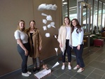
Project Runway
Savannah Steep, Emma Zollers, Lauren Poynter, and Kylie Mebs
Gestalt Theory is the way people organize and make decisions when presented with visual stimuli. One of the laws of this theory is the Law of Continuation. This law explains that elements that are arranged in a line of curve are perceived to be more related than elements not on the line or curve. In this project, the continuation can be seen through the planes. The sky and the runway are two separate entryways, however, they are connected through the diagonal pathway of the planes. This allows it to be viewed as a whole rather than two separate things. Planes are either in the air or on the runway when in motion. Through Gestalt's theories, we are able to associate the sky and the ground with each other through the use of airplanes.
Another way this project exemplifies Gestalt Theory is through the Law of Proximity. The law states that things closer to each other appear more related than things further apart. Airplanes are usually seen alone in the sky. However, the planes are 'flying' in close proximity to each other, therefore, it is perceived as a group of airplanes. The group of planes flying in the sky is being led in a diagonal line, which makes the viewer associate them all as if they are following one another.
-
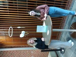
Simplicity - Back to the Basics
Adonai Brown and Ally Brown
Our design was to create an object that effectively represented the idea of simplicity. We used the Law of Continuation and Proximity.
Brainstorming consisted of what to create. How many clouds and what materials should we use. We created a paper with all our ideas and goals. We looked up each material needed and started to estimate the overall cost.
We drew a sketch of what we were thinking. We originally were going to sew the clouds but, through the process, switched to gluing the clouds and drops.
We began to cut out our clouds using a template that we made and laid out all the materials to begin the assembling process. We are pleased to say that we were able to exceed our expectations.
-
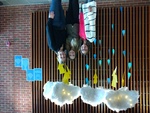
Stormy Day
Qin Raisley, Peyton Naulty, and Esther Ingram
Inspiration: This all started from a spark of an idea that one of us had seen through Pinterest. With lots of brainstorming, we decided to go with the idea of a thunderstorm since we all loved nature. The next step that continued to inspire us was the bounding ideas off of each other about what kind of supplies we would use. The narrowed down supply list came to foam board, colored paper, hot glue, sewing stuffing, lights, and fishing string. Following this decision, the inspiration part turned into the process of the project.
The Process: This was a very exciting part of the project. Shopping for our supplies was the first part of the process section of how we would achieve the next steps of assembling. During the beginning phase of the assembling part, it took some time to figure out what all of us were envisioning and coming up with a concrete plan. Once we completed this plan, we started to cut out the raindrops, lightning bolts, and the middle of the clouds. This part of the project was the longest to assemble out of the other elements that we were creating because of the surface area of the material. While the clouds were being assembled, we also lightly glittered each of the cut-out raindrops and lightning bolts with glitter. The glitter was used to create a realistic feel to the nature of the elements. The final steps of the assembling process were stringing the cutouts of raindrops and lightning to sections of fishing line. During this step, lights were stringed onto the three clouds to make them more visually appealing to the audience. This lighting addition also creates a natural glow that one would see in a real thunderstorm. Once everything was strung together, we hot glued the raindrops and lightning bolts underneath the clouds. The very last part of this project is presenting our displayed project within the Jerry Falwell Library.
Law of Similarity: For our group project we based it off of one of the laws of the Gestalt Theory, the Law of Similarity., we grouped similar items together within a large form to create some form of continuity. The clouds create a form of continuity because there are three of them so they create a line of some sort, and the raindrops and lightning bolds create a form of continuity because they are all straight and go down which creates a line. The law of similarity is used to represent a thunderstorm and the similarity about how a thunderstorm creates a form of continuity because it groups rain, thunder, lightning, and clouds together to create a thunderstorm.
-
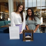
Swing into Spring
Ellie Crowfoot and Morgan Hurlbut
In this assignment, we choose to do a swing bench. Our design shows movement by the swinging of the swing from the ropes. For Gestalt theory, we decided to incorporate closure as one of our pieces of design in our project. This is shown through the pergola and how it encloses and puts a border around the swing. The color of it also gives an enclosed feeling due to the darkness of the wood stain. If this were built to a scale that someone could sit in it, it would feel like its own space but it also lets in the natural air and light because of the gaps in the post above.
In our project, we also wanted to include similarity. This is shown with the wood planks being all the same length and size. Also the pillows we used to show similarity in the project. This helps tie in the project and make it look sophisticated but classy and simple. We wanted the pergola to have a simple but peaceful feel because it is supposed to be a comfortable place to hang out and relax. For our colors, we wanted there to be closer so we chose dark wood stain. But also we wanted it to feel light and relaxing so we added whites and blue shades to incorporate that light airy feel. We feel like this project turned out the way we wanted but we had a few bumps in the road with staining the wood. Furthermore, our project is a success in our minds for what we wanted to accomplish.
-
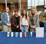
The Domino Effect
Morgan Adams, Piper Ford, Ceara Hunsucker, and Madison Trester
Gestalt Theory is a concept in design that states "The whole is greater than the sum of its parts. It employs a visual perception of putting components together." In keeping this concept in mind our team created "The Domino Effect." We were inspired by the continuous flow of dominos as they fall. The Law of Continuation states that "We see things as continued, rather than separate." We first began this project with a mind map and that is where we brainstormed the concept of using dominos as an accurate representation of Gestalt Theory.
Then during the programming phase, we researched different museum designs related to dominos. Next, the Schematic Design phase where we sketched out what this model would look like and what kind of design/color scheme we would put on the 3D domino model. During the Design and Development phase and the Contract Administration phase, we used small cereal boxes as our base and covered them in the paper. Then we added designs to all the paper boxes creating a cohesive and visually interesting piece. We used secondary colors such as orange, green, and purple to create unity within our cohesive color scheme. Lastly, we then used a diamond shape to represent the dots on our dominos. We now encourage you to observe and test out our project celebrating Gestalt Theory called "The Domino Effect!"
-
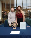
The View
Jordan Evans and Meghan Manning
For our first project, theory in action, we decided to make a Ferris Wheel. At first, we had a lot of ideas to choose from, but we finally decided to narrow it down to something relatively simple. When thinking about what supplies we needed we chose to use popsicle sticks because that was the most efficient way to construct the wheel. We started by cutting them down to make the base, wheel, and seats of the project. Along the way, we had a few bumps in the road, one being that I cut my hand with scissors and can no longer help as much as I was. But moving forward we used hot glue to secure the popsicle sticks together. To make the seats swing we used the white stick from cotton swabs and a wooden dowel was used to make the whole Ferris Wheel move. We built all the seats from different colored popsicle sticks and covered the sides with a bit of fabric to tie them all together. Once we had all the individual parts assembled, we put them all together to make a complete Ferris Wheel.
We used two types of gestalt theory, the law of symmetry and the law of continuation. The law of symmetry can be seen in the seats and where the wheels line up. If you split the wheel in half, you would have two even sides. For the law of continuation, you can see that when the Ferris Wheel is moving. Once the Ferris Wheel starts moving you cannot see where it starts or stops. It looks and keeps one continuous motion.
-
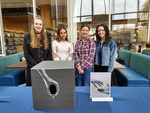
We Hold the Light
Gabby Hayes, Layla Walker, Kelseigh Monk, and Madeline Langan
Celebrating the Tenants of Gestalt Theory
Our group chose the gestalt theory of figure ground. The figure ground principle states people instinctively perceive objects as being either in the foreground or the background. They either stand out prominently in the front (The figure) or recede into the background (the ground). We chose this concept because we think that it has a unique look to it no matter what the image is. Moreover, we knew that whatever we decided that it would be an eye-catching project.
Since our group decided to use law of figure ground as our gestalt theory, we had to find ideas on how to create a physical representation of the theory. We researched different examples of figure ground and gathered ideas from a few different pictures. We found one picture that really sparked our interest and gave us the perfect idea. As a group, we came up with the plan to use a cardboard box as the main piece and cut the lightbulb shape. Lastly, we put an actual light inside the box so that when it lights up it creates light within the lightbulb cutout. We also had to make this part of the project interactive for those viewing it, so the light inside the box will have a button that sits outside of the box so that people passing by can turn the light on and off to see the figure as they please. Overall, what our project represents, referencing the title, is how Christians we hold the light. We hold the light of the world which is the truth of Jesus Christ and his gift of salvation.
Printing is not supported at the primary Gallery Thumbnail page. Please first navigate to a specific Image before printing.


