

Cape Horn
Files
Description
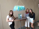
When first given this project, our group decided we wanted to implement nature into the idea of our design. That brought around the idea of water and the ocean. As we contemplated how to create something that ties those ideas together, the Law of Similarity and the Law of Continuity is really what led us to create the hanging display of art that we have now.
As we researched photos of oceans and water movement, we decided on a variety of blue shades and tints as well as one green value to create diversity in the piece. Then we gathered an assortment of materials for the bottom area that engaged the viewer by providing different textures to look at throughout the display. This invoked the use of the Gestalt's Law of Similarity the most because even though we used a variety of materials to create this project, they are brought together by similarity in colors and the way they are all bunched together along the rectangular foam board. This creates a sense of unity, so the influence of placement effected how we see the art. The Law of Continuation was also mentioned to be used in this project as well, and it is used through the rope. The brown color stands out against the sea-like colors used everywhere else and directs your eye from the top of the project to the area that is representing the water itself. The movement that the rope provided helps guide our eyes along the piece without getting lost, creating a visual sense of peace of a continuous flow that isn't harsh on the eyes. The length of each of the pieces of tule, ribbon, and strips of streamers are all roughly equal lengths, so that creates a smooth motion across the board that also guides our eyes. It represents a fluid motion throughout the project, just like how water can call travel throughout the ocean.
When coming up for the name of our project, we wanted it to tie to the idea of ocean and water as well. So, after a bit of research, we came up with "Cape Horn". Cape Horn is the place where the Atlantic and the Pacific Oceans meet. They don't mix however, so it looks like someone drew a line in between the two bodies of water. One side is a deep royal blue while the other side is a greenish watery color. Our project has both green and blue throughout it, expressing the idea of that place. Except ours mixes, so it's the "what if" mentality of the movement between two bodies of water if they did run together. The concept of imagination mixed with nature really influenced our project, and so that made our creativity reach into application of an area that is truly in our world!
Keywords
Interior Design, Gestalt Theory
Disciplines
Architecture | Interior Architecture
Recommended Citation
Allen, Madison; Keith, Kaylee; and Vivas, Sophia, "Cape Horn" (2022). Theory In Action 2022. 5.
https://digitalcommons.liberty.edu/theoryinaction_projects2022/5